Converting a Framer Boost Template to React

Overview
React Boost is an implementation of the Framer Boost Website template by Framer using React. In this post, we look into the process of converting this template into code using modern frontend patterns and concepts such as component-driven design, and component variants. We also evaluate Storybook as a tool for managing component-driven design
What is Framer Boost?
Framer Boost is free a website template by Framer. It features pre-built sections and components allowing you to quickly assemble standard website pages including landing, contact, and pricing pages. The template is a great starting point for businesses to get started with a website in just a few hours.
Why convert it to React?
I wanted to practice converting an existing design system to React components using Storybook.
Component-Driven Design with Storybook
Storybook is a powerful tool for developing and organizing UI components. It allows developers to create components independently and showcase components interactively in an isolated development environment. This approach is known as component-driven design. With Storybook, you can visualize different states of your UI components and develop them outside of your application, which leads to more reusable, testable, and manageable components.
Building in an isolated development environment like Storybook provides several advantages over building components directly into a site. First, it allows for better testing of components as they can be viewed in various states and combinations. This helps to ensure the components will work correctly in any situation. Second, it encourages reusability of components. By building in isolation, developers are more likely to create components that are not tightly coupled to a specific part of the application. This means the components can be used in multiple places, reducing code duplication. Lastly, it improves the efficiency of the development process. Components can be built and tested independently of the rest of the application, so development can continue even if other parts of the application are not yet ready.
Tailwind Enables Component-Driven Design
Tailwind CSS is a utility-first CSS framework that is highly compatible with a component-driven design approach. Instead of pre-defined components, Tailwind provides low-level utility classes that let you build completely custom designs. This flexibility allows developers to create reusable UI components with ease.
Tailwind’s utility classes also encourage the creation of component variants, as they can be combined and customized to achieve different styles. By using Tailwind, developers can work at the component level, focus on the UI’s state and behavior, and iterate quickly without writing custom CSS. Furthermore, Tailwind’s JIT (Just-In-Time) mode allows for extracting components’ classes into a CSS file, which improves performance and maintainability.
Overall, Tailwind fits perfectly into the component-driven design philosophy by providing developers with the tools to build, style, and manage components in a more efficient and scalable way.
Component Variants
Libraries like clsx and twMerge allow for more dynamic and flexible styles in React components, enabling the creation of component variants.
The clsx library is used for conditionally joining class names together, which is particularly useful when you want to apply different styles based on certain conditions or component states.
On the other hand, twMerge is a utility for merging multiple Tailwind CSS classes into a single class. This is useful for defining variants since you can create a base style with Tailwind classes and then add or override these classes to create different variants of a component.
Combining these libraries allows for a more scalable and maintainable approach to styling in React. By defining component styles in JavaScript, you can leverage the full power of the language to create styles that are dynamic, reusable, and easy to manage.
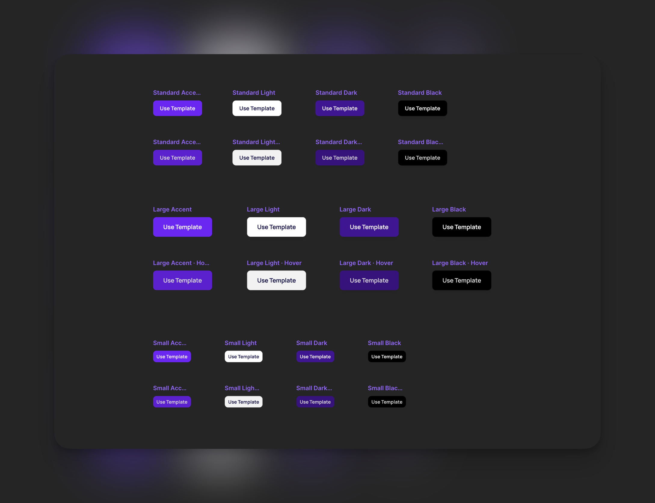
Using component variants in a button component
In the Framer Boost template, the button component takes two props: intent and size. Disregarding the hover states in the even rows in the screenshot below ( and which are just scaled up 1.05x), this means there are 12 possible buttons that can be made from these two controls:
Declaring Button Variants
The process of declaring button variants involves two steps: 1) defining them using the cva() function, and 2) setting up our React component to demand these props.
Use the cva() function to set up button variants. Pass in default styles and the options for each variant category. For intent, the component should accept accent, light, dark, and black variants. For size, only sm, standard, lg variants should be accepted. Any default styles will be replaced by the styles linked with specific intent and size variants.
1
2
3
4
5
6
7
8
9
10
11
12
13
14
15
16
17
18
19
20
21
22
23
24
import { cva, VariantProps } from "class-variance-authority";

const btnClassNames = cva(
  "py-[15px] px-[20px] rounded-[10px] font-semibold text-[18px] shadow-boost-sm gap-[6px] flex items-center leading-[1em]",
  {
    variants: {
      intent: {
        accent: "bg-purple text-white",
        light: "bg-white text-boost-text border border-boost-border",
        dark: "bg-purple-dark text-white",
        black: "bg-black text-white",
      },
      size: {
        sm: "p-[10px]",
        standard: "px-[20px] py-[15px]",
        lg: "px-[30px] py-[20px]",
      },
    },
    defaultVariants: {
      intent: "accent",
      size: "standard",
    },
  }
);
This code only declares the variants. The React component isn’t using them yet. With Typescript, set up the component to include these variant categories in their props using the VariantProps type from the class-variance-authority library. Pass the typeof btnClassNames as a type parameter.
Usually, variants are assigned to the top-level element in the component. However, cva() can be used in complex components where multiple elements may need variants.
Set className to btnClassNames(), passing in an object with the variants the component received as props:
1
2
3
4
5
6
7
8
9
10
11
12
13
14
15
16
17
18
19
20
21
22
23
24
25
26
27
28
29
30
...

const btnClassNames = cva(
  ...
);

export const Button: React.FC<ButtonProps> = ({
  text,
  className,
  intent,
  size,
  icon: Icon,
}) => {
  return (
    <motion.button
      className={tw(
        btnClassNames({
          intent,
          size,
          className,
        }),
      )}
      ...
    >
      {Icon ? <Icon className="h-[20px] w-[20px]" weight="fill" /> : null}
      {text}
    </motion.button>
  );
};
Note the use of tw() above. It’s an extended version of the cn() function from tailwind-merge, allowing users to add any additional classnames to the element. This makes the component more flexible. For a component library that needs heavy customization, this works well. To have stricter control over how a user uses a component, simply pass btnClassNames({intent, size}) to the className prop.
Now, in addition to text and icon, the component takes two props that define its possible variants: intent and size. Let’s set this up in Storybook.
Creating button.stories.tsx
In Storybook, a “story” is a single version or state of a component. It represents a single use case of the component, with a specific set of props and/or actions. Stories allow you to showcase and interact with your component in isolation, making it easier to develop, test, and document components. In the case of our button, we have four intent variants and three size variants. We should be able to create 12 stories:
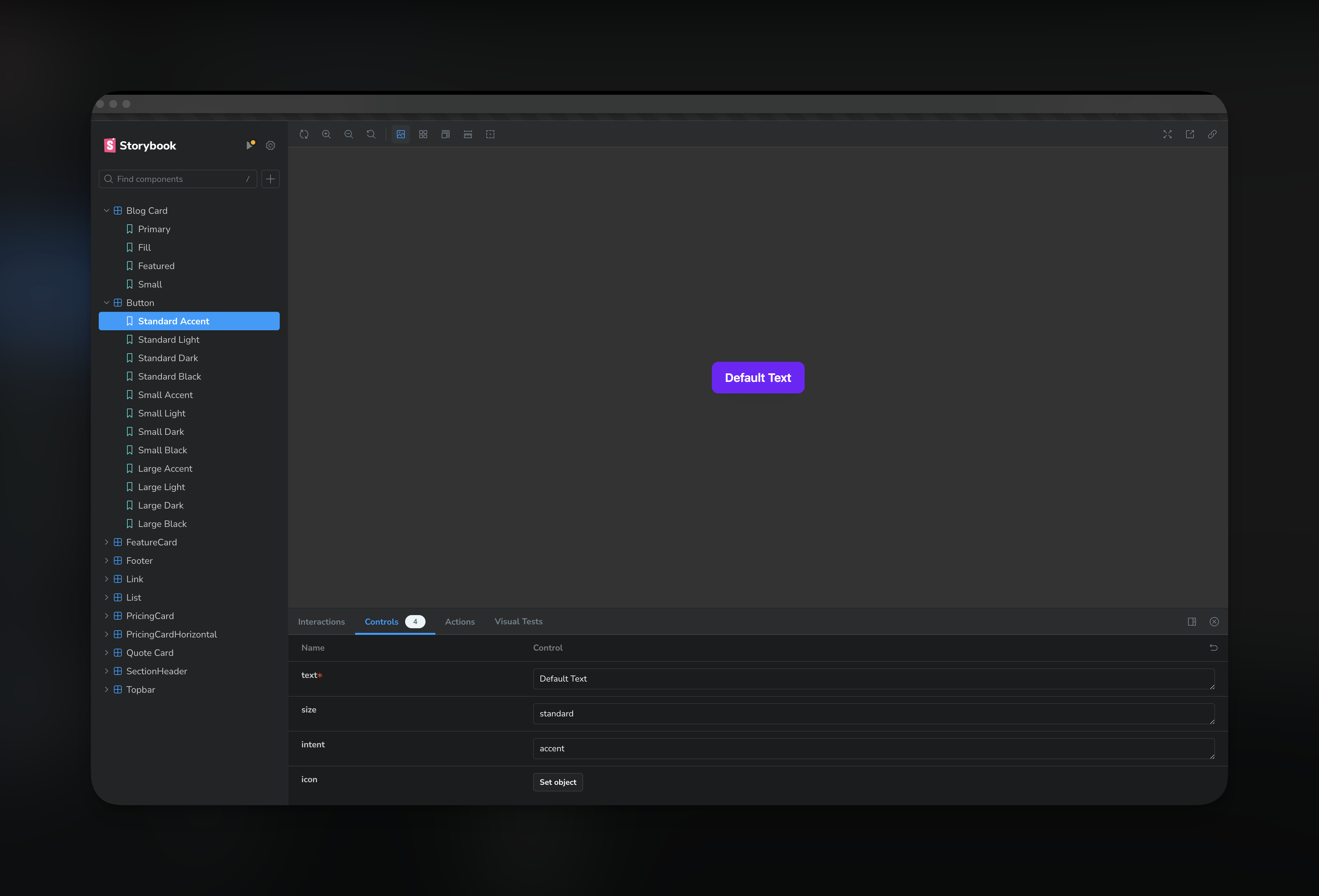
Storybook UI
Setting up a component stories
To set up a story in Storybook based on the provided code block, follow these steps:
- First, import the component you want to create a story for. In this case, the
Buttoncomponent is imported from the../components/Buttondirectory.
1
import { Button } from "../components/Button";
- Import
MetaandStoryObjfrom@storybook/react. These are used to type the exported metadata and stories.
1
import { Meta, StoryObj } from "@storybook/react";
- Define the metadata for your component using the
Metatype. This includes the title of the component, the component itself, and any default arguments.
1
2
3
4
5
6
7
const meta: Meta = {
  title: "Button",
  component: Button,
  args: {
    text: "Default Text",
  },
} satisfies Meta<typeof Button>;
- Define the type of story using
StoryObj. This will be used to type each individual story.
1
type Story = StoryObj<typeof Button>;
- Now, you can create individual stories for each variant of your component. Each story is an object with an
argsproperty that specifies the props for that variant. In this case, stories are created for each combination ofsizeandintentprop values.
1
2
3
4
5
6
7
8
export const StandardAccent: Story = {
  args: {
    size: "standard",
    intent: "accent",
  },
};
...
- Finally, export the metadata as the default export. This will be used by Storybook to generate the component’s stories.
1
export default meta;
When this is done, Storybook will generate a separate story for each exported constant. Thus, you will have a total of 12 stories for the Button component, one for each combination of size and intent. Each story will show the Button component with the props specified in args.
Here’s the full code showing 12 stories for this button:
1
2
3
4
5
6
7
8
9
10
11
12
13
14
15
16
17
18
19
20
21
22
23
24
25
26
27
28
29
30
31
32
33
34
35
36
37
38
39
40
41
42
43
44
45
46
47
48
49
50
51
52
53
54
55
56
57
58
59
60
61
62
63
64
65
66
67
68
69
70
71
72
73
74
75
76
77
78
79
80
81
82
83
84
85
86
87
88
89
90
91
92
93
94
95
96
97
98
import { Button } from "../components/Button";
import { Meta, StoryObj } from "@storybook/react";

const meta: Meta = {
  title: "Button",
  component: Button,
  args: {
    text: "Default Text",
  },
} satisfies Meta<typeof Button>;

type Story = StoryObj<typeof Button>;

export const StandardAccent: Story = {
  args: {
    size: "standard",
    intent: "accent",
  },
};

export const StandardLight: Story = {
  args: {
    size: "standard",
    intent: "light",
  },
};

export const StandardDark: Story = {
  args: {
    size: "standard",
    intent: "dark",
  },
};

export const StandardBlack: Story = {
  args: {
    size: "standard",
    intent: "black",
  },
};

export const SmallAccent: Story = {
  args: {
    size: "sm",
    intent: "accent",
  },
};

export const SmallLight: Story = {
  args: {
    size: "sm",
    intent: "light",
  },
};

export const SmallDark: Story = {
  args: {
    size: "sm",
    intent: "dark",
  },
};

export const SmallBlack: Story = {
  args: {
    size: "sm",
    intent: "black",
  },
};

export const LargeAccent: Story = {
  args: {
    size: "lg",
    intent: "accent",
  },
};

export const LargeLight: Story = {
  args: {
    size: "lg",
    intent: "light",
  },
};

export const LargeDark: Story = {
  args: {
    size: "lg",
    intent: "dark",
  },
};

export const LargeBlack: Story = {
  args: {
    size: "lg",
    intent: "black",
  },
};

export default meta;